Case study
Hard surface modeling in Figma
Faking the look of a 3D product render — an Apple Watch, a pair of headphones — using nothing but vector shapes, gradients, and a careful read of how light falls.
When you’re making promotional or “key” shots of a physical object — especially a tech product — realism is everything. Sometimes the image even has to refer to a product that doesn’t exist yet. Either way, the object needs a real-world feel: it has to look the way a person expects it to look. You obviously can’t do real hard surface modeling in Figma. But “hard surface modeling in Figma” is what I’ve come to call a handful of techniques I lean on to make product renders look great with little or no cleanup in post.
This is a walk through how I build these — using an Apple Watch Series 9 I rebuilt as a free community file, plus a pair of headphones from my working notes, as the examples.
Why do it in Figma at all?
If you’re creating shots of phones, watches, computers, and other things with screens, the chances are good you’re also designing the software that goes on those screens. The chances are just as good that you’re already doing that in Figma. So why not keep the workflow for the hardware comps in Figma too?
Staying in one tool has real advantages. The artwork is resolution-independent, so the same file gives you a favicon-sized thumbnail and a billboard. Every surface stays editable forever — change the band color, the case finish, the angle of a highlight, long after the render is “done.” And there are no render times and no round-trips to a 3D app for a product that may still be changing week to week.
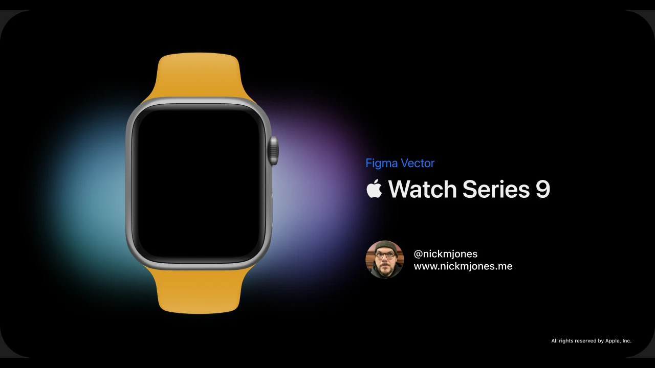
The example: Apple Watch Series 9
 The whole watch is vectors — aluminum case, digital crown, side button, and sport band.
Nothing in this image is a photograph or a 3D render. The case, the crown, the side button, and the sport band are all vector shapes. The band, for instance, isn’t one object — it’s a base shape that defines the silicone’s form and color, with a separate highlight shape stacked on top so the rubber catches light along its edges and through the lug. The aluminum case is built as a reusable component, so the exact same watch can drop into any shot at any size without rebuilding it.
That component-plus-stacked-shapes approach is the backbone of the whole technique: model the form once, then layer light and shadow on top of it as discrete, editable pieces.
And on the clock
This isn’t only a personal exercise. I lean on the same techniques in my day job — here’s a Tile Mate I rendered for work at Tile, built the same way: a rounded body, a recessed keyring hole, the debossed logo, and a rim of cool light raking across the plastic.
 Tile Mate (2022) — a shipping product render, vectors all the way down.
The value at work is the same as the value at home: when the product, the color, or the marketing angle changes, the “render” is just a Figma file. You nudge a few shapes instead of re-rendering.
The hard part: seams, gaps, and transitions
A large part of selling the realism of a vector rendering is in how you handle seams and the transitions from light to dark. This is where it pays to study the actual product — or a real render of it — to understand how light actually falls on edges and corners.
A hard edge is almost never a single hard line. Look closely at a chamfer or a crease and you’ll usually find a thin bright highlight sitting right next to a thin dark occlusion, both riding on top of the base color. So that’s how I build them: stacked slivers of shape, a tight gradient for the metal, and a soft blur to let the falloff read as a curved surface rather than a flat fill. Gaps between parts get the same treatment — a sliver of shadow where two pieces meet does more for believability than any amount of texture.
 Every reflection, seam, and soft shadow on these headphones is a stacked vector shape.
From render to “product photography”
Once the object reads as real on a neutral background, you can start to shoot it. The studio version — object on a dark gradient with a soft contact shadow — is the clean, catalog-style take. But the same vector object can be composited into a scene to look like it was actually photographed there.
 Left: the studio render. Right: the same vectors dropped into a blurred environment, with the light and color temperature matched to the scene.
The moves here are borrowed straight from product photography: put the object in a believable space, throw the background out of focus with a blur so it reads as depth of field, and nudge the object’s highlights and color temperature to match the room’s light. Because everything is still vectors underneath, you can re-shoot it against a different “set” in seconds.
Concept art: things that don’t exist yet
This is where the technique really earns its keep. Because you’re not photographing anything, you’re not limited to products that exist. The same seams-and-transitions discipline lets you imagine hardware whole — a fictional “Procyon” lineup of moody, late-night 80s electronics, for instance — and render it as if a real unit were sitting on a desk under studio light.
 A concept console that was never built — every bevel, screen reflection, and grille slot is a vector.
 The chamfered ring and the depth of the perforations are all faked with stacked shapes and blurs.
For pitching an idea, exploring an industrial-design direction, or just making something beautiful, this is the promise: a believable product shot of a thing that only exists in the file.
Why it’s worth it
None of this replaces a proper 3D pipeline when you need one. But for the work most product and interface designers actually do — a hero image for a landing page, a press shot, a concept for a device that isn’t built yet — staying in Figma is faster, endlessly editable, and lives right next to the UI work it’s supporting. The trick was never the software. It’s learning to see how light describes a surface, and then rebuilding that, one deliberate shape at a time.