A tale of UX circa 2022
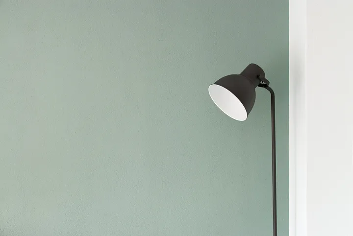
I’ve recently started working in the basement of our little 1960’s ranch house in the suburbs of Rhode Island. Disappearing underground for hours at a time and working for a company outside of the timezone I live in have both done a real number on my sleep. I needed lots of non-blue light to put me at ease, help me remember it wasn’t nighttime—and generally keep me from going nuts.
I spent an evening looking at lamps to go beside my desk. Finally I found something I liked in the app of a big online retailer. The confluence of Apple Pay being built in to my phone, and an existing login with this retailer, made the purchase fly by. In no time I had an email thanking me for my purchase. I pasted the tracking number into Deliveries, noticed it was one of those shipments that you can only track online, and went about my day.
But then the lamp got lost, or redirected, or otherwise delayed. I finally caved and logged directly into FedEx to see what the issue was. It was there that I discovered that super-fast checkout flow left out one critical detail: it never allowed me to review my address. My lamp was now en route to an address I hadn’t lived at for almost 6 years.
And worst of all I learned that I had somehow chosen this flow, that there was a better and more conventional one hiding in there somewhere. Again and again I was told by customer support that I was “not the first”, and that I should “be careful” when making purchases through their store.
When I tell people that I’m a product designer for a living, I can tell they have a lot of different thoughts in rapid succession; if they’re of a certain age, they ask if they might have ever bought anything I designed. Oh, not that kind of product I tell them.
Lately I explain simply that I design things like apps and websites, and that my job is making it easy to do the right thing.
For any kind of designer, this is a primary goal—stated or unstated. As an artist, I might want to communicate meaning or feelings to people. A poster designer wants basically the same thing. As a designer of experiences, we tie lots of small interactions into one harmonic whole that we hope will guide users down the “happy path” to…something. For all the designers there is an empirical “correct” response we’d like from our audience.
Sometimes, the response they’re looking for is that users trip and fall into a hole. You click a headline because it’s salacious. You rush through the checkout because there’s a timer, and when it elapses you lose your “15% off” coupon. So-called “dark patterns” push users to do things that aren’t in their best interests.
And sometimes, patterns are just shitty.
Wanting to make something like a checkout process feel faster is something we’re called to do a lot. Like the middle-manager instructed to find a few million extra dollars somewhere in his budget, we can only eliminate so much free coffee and copier paper before we realize it isn’t working and we have to start firing people.
You start tearing entire screens out of your app. You abbreviate and truncate, and put things in modals and under out of the way buttons. You build a cul de sac with a submit button at the end. It works for a while. Until the chargebacks start, or until packages—big ones like couches, 70 inch TVs—start winding up on entirely different seaboards from their purchasers because the screen you chopped out was the confirm this is where you currently live screen.
More than acumen, or technical know-how, or raw design talent, you will need empathy. This is the entire purpose of user personas. They help you target your designs, sure, but they also give a face and a name to the person you want to help to accidentally do the right thing. And it’s empathy and human compassion that help to ensure that “right thing” is really a right thing.
I never got my lamp. It’s sitting in the lobby of the condo I lived in 6 years ago, the best lesson I ever got in empathetic design made manifest.